REBRAND CLASSIC NOVEL
with creative typography treatment
The text is “The Time Machine” from the author H.G. Wells. The text was published in 1895 for the first time. Main typeface used here is Baskerville, a classic font created by John Baskerville from Birmingham. The Baskerville typeface is categorized as a transitional typeface between old style typeface of William Caslon, and the modern styles of Giambattista Bodoni and Firmin Didot. The main reason this typeface is use for this novel is because the Baskerville typeface has the unique concept of being in-between both classic and modern design, which can effectively portray the concept of travelling from present to future of time machine.

The concept used for the front cover is about blue print. Here, blue print paper is utilized for the concept as it helps relate to the invention and design of the time machine. I believe the idea of an inventor uses blue prints as they design and create the machine, is similar to a designers’ need to use sketchbooks to visualize their designs. On the other hand, the concept of the cover design, where 12 light stroke flashes out from the word “Time Machine” symbolizes the 12 chapters in the novel.


As for the content, a new layout system is created for the purpose of showing how the plot of the story flows. The story is mainly divided into 3 section using 6 columns.
First section, when the time traveller is in the past or present, all the text will be aligned to 4 columns on the left side of the page. Second section is when the time traveller describes his experience and feelings while he is time travelling; here, the text will be placed within 4 columns but in the middle of the page with text flows like a river of readable alphabets. Third section, on the other hand, is when the time traveller arrived at the future. The text here will be aligned to 4 columns on the right side of the page.


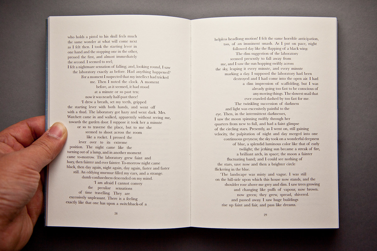

With this system, it will help the readers to have a clearer idea of the time traveller’s timeline and position, and it also enables the readers to visualize the sensation of time travelling. This layout system is also applied to the content page as well where the page numbers will be aligned left n right according to the flow of the chapter.
Thank you for scrolling
"appriciate it" is much appriciated :)


